Today we look at long-run economic growth, and along the way compare the results of a running average calculation to a more complicated (but no doubt more accurate) calculation that the BEA uses to figure average annual growth.
The other day I read that the
GDP Growth Rate in the United States averaged 3.21 percent from 1947 until 2017
That reminded me of Marcus Nunes telling me
It´s more or less recognized that US RGDP is trend stationary (maybe that´s changed now!), with real growth averaging about 3.3% from the early 50s to 2007.
I'm not comfortable using averages that way. Compared to the economic growth of the last ten years, 3.21% average growth (1947-2017) seems quite high. And yet 3.21% is noticeably lower than Marcus's 3.3% for the period ending in 2007. It seems the more recent the end-date, the lower the average growth. I want to look at the numbers.
(Yes I know, the two long-term averages have different start-dates too. That's another reason I have to make my own graph!)
The first graph today shows Real GDP (annual data, faint gray, right-hand scale) along with annual growth rates (blue), an average of the growth rate values (red), and an average I got by using the BEA's "variant of the compound interest formula" (green):
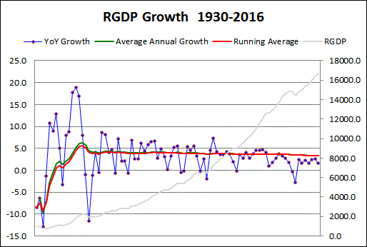 |
| Graph #1: On the right is where we have been recently. On the left is where we were before. |
I was happy to see there is not much difference between the red and green lines. No doubt the BEA's method is more accurate than a simple running average, but the running average looks like a good rough estimate. And the two lines seem to follow a similar path.
The blue line is up near 10% growth for a few years in the mid-1930s, and approaches 20% in the early 1940s. There are extreme lows before and after these extreme peaks. Then the next high after that has two dots a little below 10%. Those two dots represent 1950 and 1951. The second graph begins in 1952, and shows the same values as the first graph:
 |
| Graph #2: On the left is where we were before. On the right is where we have been recently. |
Also, it is a little more obvious on this graph that average RGDP growth is in decline; red and green both show it. The averages ran at or above the 4% growth rate until 1980, then fell noticeably below the 4% rate.
Blue dots above the average pull the average up. Blue dots below the average pull the average down. The last blue dot above the average occurred in 2004.
//
The red and green lines never go as low as 3%. So for any year you pick, it wouldn't be wrong to say "The GDP growth rate in the United States averaged above 3.0 percent from 1952 until [year]". Sounds pretty good, right? Especially compared to the slow economy of recent years.
It is even true. But it is nonsense. Economic growth has been slowing. And the trend of growth has been slowing. The trend shows where the economy is going in the longer term.
You don't get a feel for where the economy is going when somebody says the average growth rate since 1947 is 3.21%. There were a lot of good years since 1947, that helped to bring the average up. That doesn't do us any good when we've been below the average for years. It's like you got an F on a test and your parents find out, and you tell them "Yeah, but the class average was a B!" That's not gonna help you.
And it doesn't give you a feel for where the economy is going when an economist says GDP is "trend stationary" at 3.3%. It doesn't even sound like things are going downhill. But they are.
// The Excel file

No comments:
Post a Comment