Back in February I came across this graph at The Current Moment:
 |
| Graph #1 |
 |
| Graph #2 |
Both graphs show productivity. The one graph compares productivity to compensation, the other compares it to wages. Both wages and compensation lag productivity. But compensation increases a lot more than wages, because compensation (as the source site explains) is wages plus benefits.
I find it useful when people provide background information like that. But that's not what caught my eye. It's the difference in separation points that caught my eye: On Graph #1 the "wages" line breaks away from the productivity line suddenly, just around 1974. On Graph #2 the "compensation" line breaks away from the productivity line gradually, but also much earlier -- possibly as early as 1960. This is the kind of thing that fascinates me.
I did notice that the first graph is indexed "relative to 1970" while the second is "rebased to 1960". In other words, on Graph #1 the lines have the same value at 1970 and on Graph #2 they have the same value at 1960. (The other values are adjusted accordingly.) This choice of different "base" years changes the date that the lines on the graph appear to separate, and affects the impression that the graphs give us. I think we are hoodwinked by the indexing.
On Graph #1 in particular, between 1955 and 1975, it's pretty clear that the orange line is going up faster than the red line. If you could take the whole red line and just move it down a little bit, you might make the two lines touch at only one point. That point would be around 1956. And if you looked at that graph, you would see real wages falling behind productivity since 1956.
You should find it disturbing: not only the decline, but also the many years of decline that are overlooked when we say that compensation fell behind productivity around 1974.
The second graph, Henwood's graph, seems to show compensation falling behind productivity since about 1960. But it doesn't show earlier data, so it leaves the door open. 1956 is not shown to be wrong.
I followed the Current Moment link back to Doug Henwood's and liked what I found there. I emailed Henwood:
Hi. I recently came upon an old page (2001) at Left Business Observer
http://www.leftbusinessobserver.com/Stats_earns.html
I'd like to use your "productivity and compensation" graph on my blog. The page says I should get permission first, so I'm asking.
All the similar graphs that I've seen focus on the separation beginning mid-1970s. Your graph shows the separation beginning much earlier. It was eye-opening for me.
"Heavens," Henwood replied. "I have much more recent versions of that - let me find one for you tomorrow." He did, too:
.png) |
| Graph #3 |
The three lines on this graph combine the three different series shown on the first two graphs above. In addition, on Graph #3 the series are indexed to 1964. And -- don't you know it! -- the separation point this time looks to be the late 1960s, or earlier.

A little over a week ago -- it seems much longer -- I was reading a discussion at Reddit. The topic was "What might actually be holding back workers’ wages".
Somebody blamed Reaganomics. One guy, I'll call him Joe, rejected that idea: "Your idiotic blaming of Reaganomics would be dependent on Reaganomics traveling back in time a decade and starting the trend in the mid 70's," Joe said.
I love it. That's one of my themes: You can't just blame the guy you don't like, especially if the things you're blaming him for happened before his turn at bat. Reminds me of a Mike Kimel quote that Jazzbumpa has in his sidebar:
No doubt.
Anyway, Joe provided a link to a "productivity and real wages" graph -- the same graph from The Current Moment that I have as Graph #1 above. Small world.
I complimented Joe on the graph. But then I went off-topic, so much that Joe had to disagree with me. I pointed out that the graph is indexed "relative to 1970". I said: "If the graph was indexed relative to 1956 we would see the slowing of wages begin in the mid-1950s and slow more since the mid-1970s."
Joe replied: "That is not how the graph would change changing the index year at all. Here is one indexed to 1947. There is still a trend starting at 1970 where wages and output are decoupled."
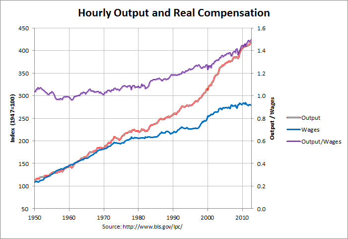
He showed this graph:
 |
| Graph #4: http://www.econdataus.com/wagegap12.png |
Yeah, the red and blue lines are comparable to those in the graphs above. And yeah, the base year is 1947 this time.
But this graph has a third line -- the purple line -- that shows the ratio of the red and blue. Nice! I was going to get around to showing the ratio.
The purple line shows how productivity ("hourly output") is changing relative to wages. And if you look at the purple line you can see it starts going up around 1956 or 1957. That means productivity started gaining on wages around 1956 or 1957. (And come to think of it, the blue line on Graph #4 looks like wages plus benefits, not just wages.)
Wages started falling behind productivity around 1956 or 1957. So if you want to blame Reaganomics... or if you want to blame Jimmy Carter or Gerald Ford or Richard Nixon or Lyndon Johnson -- or John F. Kennedy for that matter -- to do it you will have to make time go in the wrong direction. You'll be breaking Rule #15.
The failure of wages and compensation to keep up with productivity is a problem that began in the 1950s.
Yesterday, at The State of Working America I found this graph from the Economic Policy Institute:

It is similar to the graphs above. The dark blue "productivity" line goes up faster than the light blue "compensation" line since the mid-1950s. But the indexing has the two lines tangled together so you don't notice compensation falling behind until the mid-1970s.
This graph is important because it comes with this data. (Excel XLSX, 37KB) So of course I took the file, uploaded it to Zoho, and customized it for on-line use.
Please make sure the proper spreadsheet tab is selected on the spreadsheet below: At bottom-left in the spreadsheet window there is a little triangle pointing up, then there are the tabs (which you can read only part of), and then there is a left-pointing triangle and a right-pointing triangle. You want the last tab. To access it, click the right-pointing triangle. The text in the tab area scrolls so you can see "Adjustable Base Year" or maybe only "ble Base Year" (which is what I see). Anyway, click that gray "Base Year" tab. The tab will turn white and the worksheet area will change to show a tidy little graph, and above it a yellow spreadsheet cell with a date in row 1. Click the yellow cell to select it.
Change the 4-digit year value in the yellow cell to "rebase" the two lines to the year of your choice. The graph runs from 1948 to 2013. You can use any year in that range to change the base year for the graph. It shows you that Compensation started falling behind productivity right around 1956.
Spreadsheet-handling hints and other edits, 14 August 2022 by Art

1 comment:
This is an excellent post, Art.
Yes, there is s spread starting earlier, at some difficult to define point in time. But the big decoupling starts in the early 70's.
I looked at a different variable here, landing on 1973, as the inflection point.
http://jazzbumpa.blogspot.com/2011/02/real-disposible-income-per-capita.html
The indexing issue flew over my head in this post.
http://jazzbumpa.blogspot.com/2010/07/productivity-its-wunnaful.html
What makes a trend change, and what makes a trend continue? Carter was a generally conservative democrat, and deregulation began during his term.
But the separations really widen from the mid 80's on. I attribute this to Reagan's policies taking effect.
At a detail level, there are some discrepancies among the graphs. But in several of them you can see the compensation lines' slopes go negative by the middle of the 80's. That is absolutely Reaganomics.
Cheers!
JzB
Post a Comment